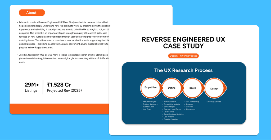
I chose to create a Reverse-Engineered UX Case Study on Justdial because this method helps designers deeply understand how real products work. By breaking down the existing experience and rebuilding it step-by-step, we learn to think like UX strategists, not just UI designers. This project is an important step in strengthening my UX research skills, as it focuses on how Justdial can be optimized through user-center insights to solve common usability issues. The ultimate aim is to enhance user satisfaction while supporting Justdial’s original purpose—providing people with a quick, convenient, phone-based alternative to physical Yellow Pages directories.
Web Design
Ui/UX Design
Research and Strategy

Client
Framer Marketplace
Project Duration
Nov 1 - Dec 29
My Role
Team Leader
Problem Statement
Lack of centralized, up-to-date information
Limited advertising reach for small businesses
Technology and literacy barriers
New person in new city struggle for finding near shops, medicals, hotels, hospitals, grounds, bus timetable etc.
Users search to many apps for to many services.
Consumers faced issues finding reliable local info, while businesses sought cost-effective advertising.
Solution
Provide one platform to users instead of searching to many apps or platforms.
24×7 Toll-free voice search
Focused on getting the accurate data in place” as the service’s strength.
Sponsored-search advertising (pay-per-call) and pricing transparency.
One platform for all service search.
They did not focused on only one service search.
Key Features
User research and problem identification
Clean and minimalist UI design
Wireframing and prototyping (low to high fidelity)
User flow and information architecture
Usability testing and design iteration
Mobile-first and responsive design
Design systems, grids, and spacing rules
Team collaboration and group projects
Accessibility and usability-focused design
Clear visual hierarchy and typography


Result
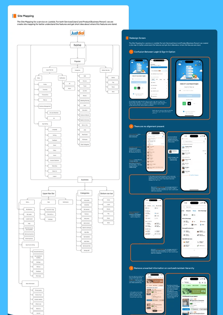
By the end of my research, I created a cleaner and more structured sitemap that simplifies how users move from:
Search → Compare → Contact
Key outcomes from this project:
Clear understanding of user pain points
Suggestions to improve navigation & Site map
Better presentation of trust signals (reviews, verified badges)
Focus on key actions to improve conversions
Takeaway
Too much information on one screen confuses users
Clear hierarchy helps users find services faster
Search and filters need to be simple and familiar
Trust elements like ratings, reviews, and photos matter a lot
Users prefer fewer steps to contact or book a service
Consistent layout improves usability and confidence
Thank you!
Feel free to reach out if you have any comments or thoughts.

